
My Design Journey
Hello! I’m Emma, an entry-level UX/UI designer transitioning from a data-focused career. This case study highlights how I’m using my strengths in analysis and visualization to build thoughtful, intuitive digital experience as I grow in this field.
Project overview
The product:
Mobile ordering application for ME Bakes, allowing customers to browse the menu, customize orders, and make payments through their smartphones.
Project duration:
The project spanned over 8 weeks, from initial concept to prototype development.
The problem:
Customers faced long wait times during peak hours and difficulty in customizing orders accurately.
My role:
Lead UX designer
The goal:
To enhance customer satisfaction by providing a seamless and efficient ordering process through a user-friendly mobile app.
Responsibilities:
Conducting user research, creating wireframes and prototypes, and ensuring the app meets accessibility standards.
Understanding the user
User research: summary
User research was conducted using surveys, interviews, and usability testing. These methods helped in understanding user preferences, pain points, and expectations regarding the mobile ordering process. User feedback was crucial in shaping the app's design and functionality.
User research: pain points
Pain point 1
Long Wait Times
Customers often experience significant delays during peak hours, leading to dissatisfaction.
Pain point 2
Inaccurate Orders
Miscommunication between customers and staff results in frequent order errors.
Pain point 3
Limited Customization Options
The in-store menu doesn't always clearly present all available customization options.
Pain point 4
Inconvenient Payment Process
The traditional payment method can be slow and cumbersome, especially during busy periods.
Persona: May June
Problem statement:
May June is 22 years old, college student, a frequent coffee shop visitor, who is a Tech-savvy and values convenience so she prefers mobile ordering for efficiency.

User journey map
I illustrated May June’s action and feelings by creating user journey map. And then we can address user’s pain points and further improve in identified areas.

My Design Journey
Hello! I’m Emma, an entry-level UX/UI designer transitioning from a data-focused career. This case study highlights how I’m using my strengths in analysis and visualization to build thoughtful, intuitive digital experience as I grow in this field.
Project overview
The product:
Mobile ordering application for ME Bakes, allowing customers to browse the menu, customize orders, and make payments through their smartphones.
Project duration:
The project spanned over 8 weeks, from initial concept to prototype development.
Understanding the user
User research: summary
User research was conducted using surveys, interviews, and usability testing. These methods helped in understanding user preferences, pain points, and expectations regarding the mobile ordering process. User feedback was crucial in shaping the app's design and functionality.
User research: pain points
Persona: May June
User journey map
I illustrated May June’s action and feelings by creating user journey map. And then we can address user’s pain points and further improve in identified areas.
Starting the design
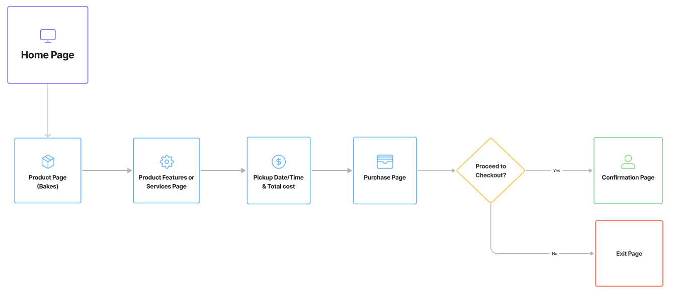
Sitemap
I created an user-focused flow for my persona to complete the key objectives without going through pain points.
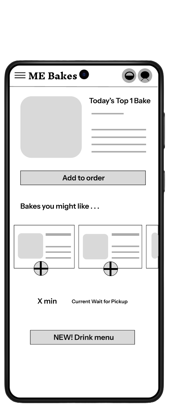
Paper wireframes
I drafted the iterations on the user flow to complete the key objectives and also the design for how it should look on each task.
Digital wireframes
Through digital wireframe design, all placeholders are arranged so it well represented the user flow and met user’s needs.
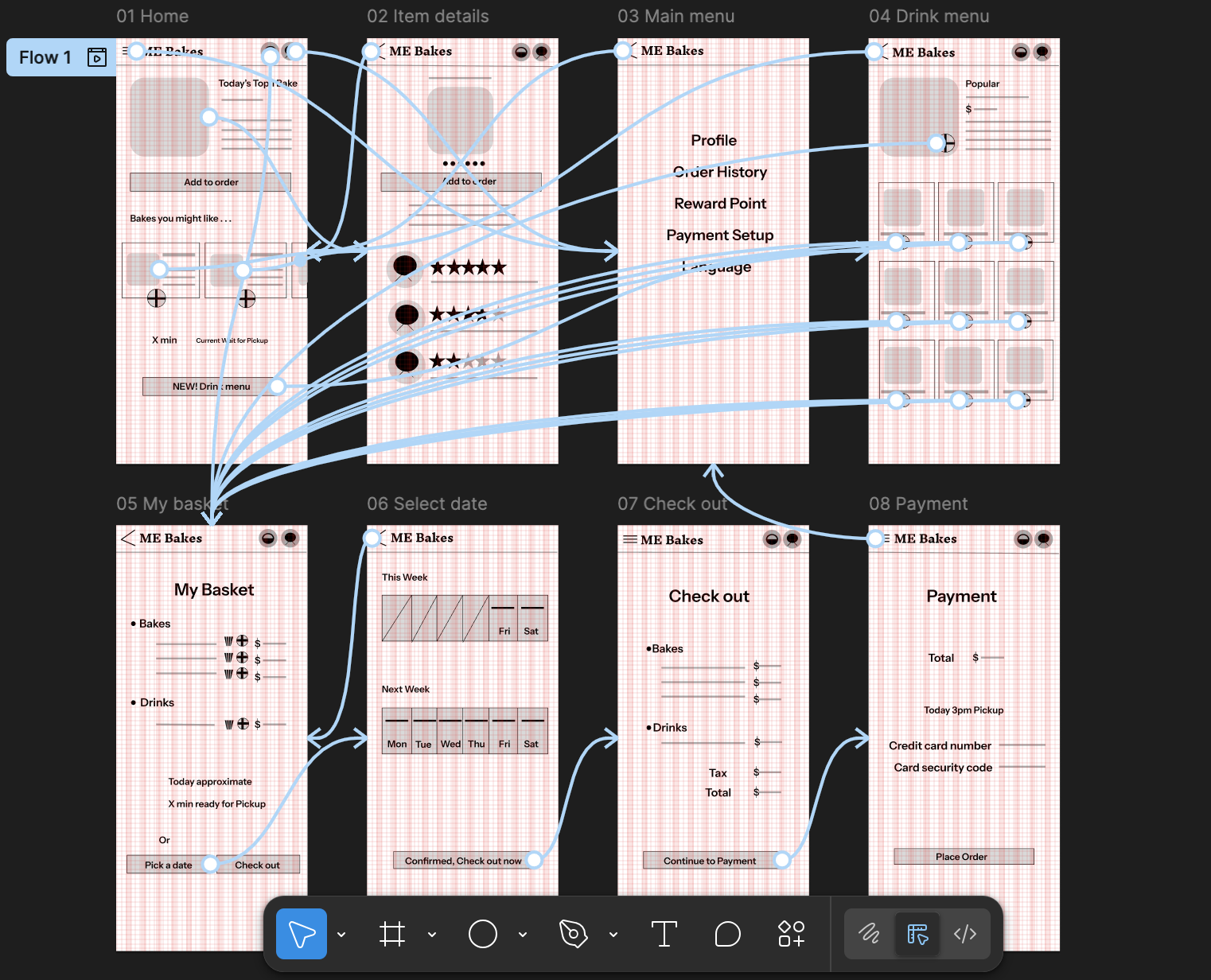
Low-fidelity prototype
I created the low-fi prototype from the user flow diagram and the wireframe to test the functionality before incorporating it into the final mockup and ensure accessibility for end users.
Usability study: parameters
Usability study: findings
I’ve listed some key insights below from the usability study and we need to define the problems for our design to resolve.
Refining the design
Mockups
Based on the insight from the usability study, I updated the design outlook by incorporating a clearer navigation flow and a conventional date/time picker.
High-fidelity prototype
After finalizing the low-fi prototype, I focused on the final design to make the visual more intuitive and appealing. The color theme is orange, representing warmth and comfort, just like how you feel when having a fresh & out-of-the-oven bake.
Accessibility considerations
Going forward
Takeaways
Impact:
The ME Bakes app has the potential to significantly improve customer satisfaction by reducing wait times and minimizing order errors. It also provides a more convenient and personalized ordering experience.
What I learned:
I've gained valuable experience in conducting user research, creating user-centered designs, and implementing accessibility features. This project has reinforced the importance of understanding user needs and iterating based on feedback.
Next steps
Let’s connect!
Questions? Feedback?
We'd love to hear from you!
Contact Information
Email: mebakesapp@email.com
LinkedIn: linkedin.com/in/mebakesappteam
Thank you for your time!
The problem:
Customers faced long wait times during peak hours and difficulty in customizing orders accurately.
My role:
Lead UX designer
Pain point 1
Long Wait Times
Customers often experience significant delays during peak hours, leading to dissatisfaction.
Study type:
Unmoderated usability study
Pain point 2
Inaccurate Orders
Miscommunication between customers and staff results in frequent order errors.
Problem statement:
May June is 22 years old, college student, a frequent coffee shop visitor, who is a Tech-savvy and values convenience so she prefers mobile ordering for efficiency.
Location:
United States, remote
Finding 1
A large amount of bake and beverage information listed so it’s better to highlight some popular items for users’ reference to begin with
Before usability study
Screen Reader Compatibility
Ensured the app is fully compatible with screen readers for visually impaired users.
The goal:
To enhance customer satisfaction by providing a seamless and efficient ordering process through a user-friendly mobile app.
Responsibilities:
Conducting user research, creating wireframes and prototypes, and ensuring the app meets accessibility standards.
Pain point 3
Limited Customization Options
The in-store menu doesn't always clearly present all available customization options.
Pain point 4
Inconvenient Payment Process
The traditional payment method can be slow and cumbersome, especially during busy periods.


Participants:
5 participants
Finding 2
Most users already have their favorite bake/beverage types so adding a “search” by text input might accelerate the ordering process
Length:
20-30 minutes
Finding 3
Many users recommend to save the latest order information (items, pickup date/time for occurring orders) to expedite future ordering process
After usability study


Adjustable Font Sizes and Color Contrast
Implemented adjustable font sizes to accommodate users with different visual needs.
Utilized sufficient color contrast to improve readability for users with color blindness.
Keyboard Navigation
Designed the app to be fully navigable using a keyboard for users with motor impairments.
Conduct Further User Testing
Gather additional feedback on the app's usability and identify areas for improvement.
Develop a Marketing Strategy
Create a plan to promote the app to ME Bakes customers and increase adoption rates.
Integrate with the POS System
Implement seamless integration with the existing Point of Sale (POS) system for efficient order management.