
Welcome to Emma G.’s Inspiring Space
Where art design and parenting collide and spark, this blog captures the creative chaos of juggling both worlds.
Recent Posts

Adobe Graphic Design Proposal - ME Bakes
For completing last stretch of Adobe Graphic Designer Professional course, a business proposal - graphic design proposal, is created. I thought I might just use my dream start-up “ME Bakes” for this practice in case there is a chance to be used in the future (you never know). I did apply example proposal contents for professionalism and business familiarity practices.
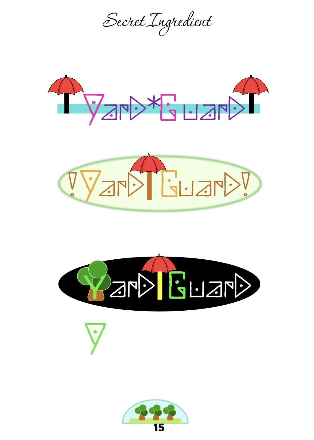
Graphic Design - Brand a Brand
It’s a big project to include eighteen elements in a presentation. I used a practical example for my “YardGuard” weather-proof startup company and have hands-on practice on a professional design tool Figma.

Graphic Design - Composing a Complex Narrative
Composing a simple book by assembling the images and spreads I have collected from previous practices and made into one place. Setting up an eight page book consisting of 8 spreads (3 double page spreads plus a front and back cover) takes me some time to figure out indeed.

Graphic Design - Range of Representation
It's interesting to construct images from realism to abstract. Sketch based on real objective seems working out the most for me while abstract innovation takes me longer time trying to catch it's spirit.

Graphic Design - Improvisation
I began with my backyard during playtime with kids. It's fun to pick up whatever is available in the backyard and I finished four images in no time. Continued the rest ideas with all my resources in the playroom and my craft stash. Due to material constraints sometimes, I altered the images in my head and improvised as the collection and process went. Overall the outcome was not far from my expectations.
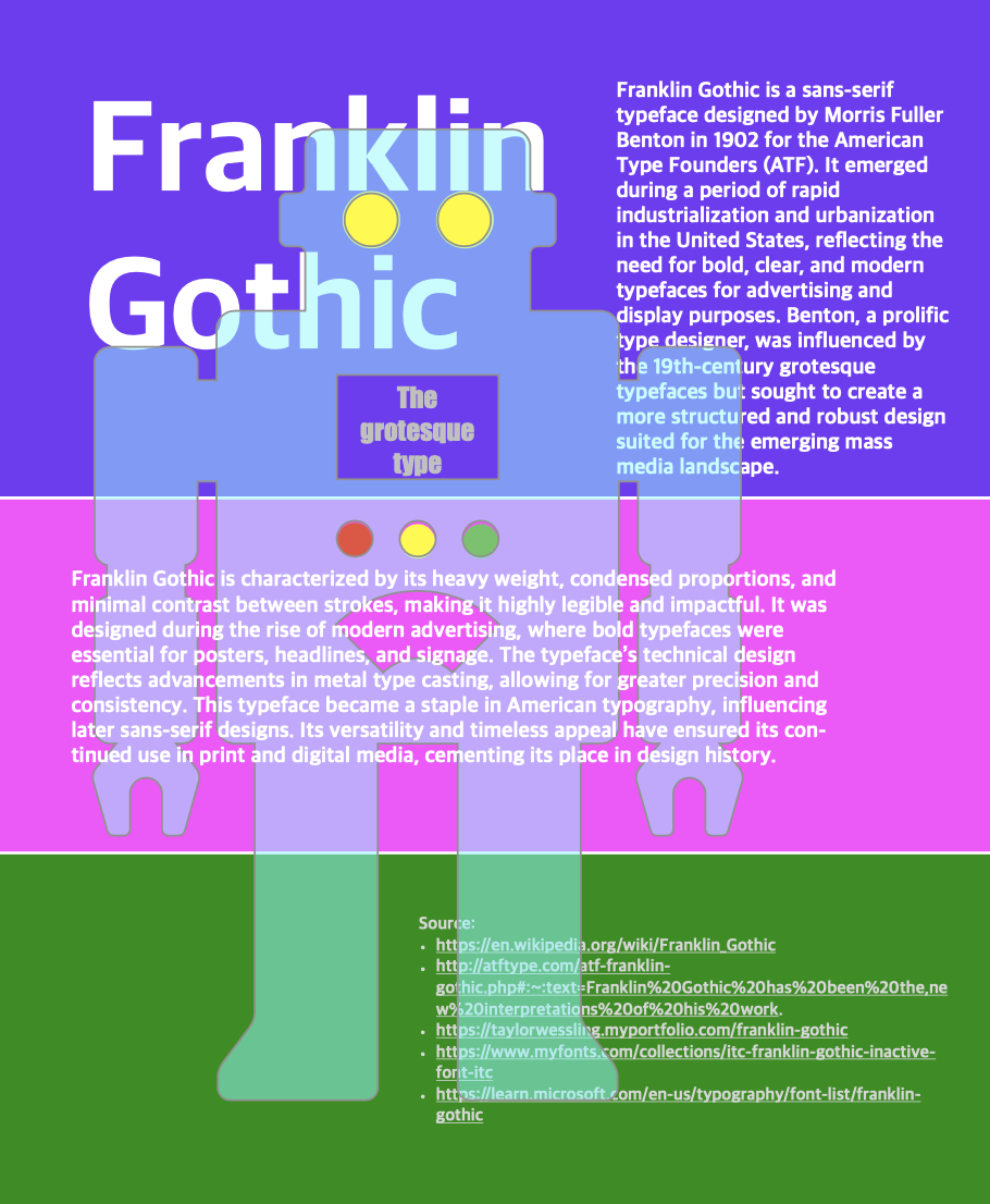
Graphic Design - Typographic Poster
Typographic poster isn’t easy for all these tiny letters and the principles of typesetting to be dealt with. I’m thinking a robot may describe characters of “Franklin Gothic” for it’s heavy weight, condensed proportions, and minimal contrast between strokes.

Graphic Design - The Pretty Banans (Poster)
My first graphic design poster - The pretty bananas (Inside & Out) by assembling previous four weeks of practice and assignments in a new combination.

Graphic Design - Contrasts
Contrast combination of doubles and triples of below arrangement just by simple shapes:
scale
weight
direction
space
form
texture

Graphic Design - Complimentary & Contrast
It’s like an experiment playing with sorts of graphic forms. I’m making graphic design by building blocks to best learn graphic design.

Graphic Design - The Character of Characters
The character of characters - Typeset the name of an object (e.g. "apple", "shoe", or "glasses" etc.) in a typeface that relates to (or represents) each of the adjectives (e.g. “plump”, “old”, “vintage” etc).
The top strokes looks like the stems where you grab the bananas and there are a bunch of them. Just an objective text name in different forms creates imagination and possibilities!?

Graphic Design - Monogram & Business Card
Create a design of interlocking typographic forms by using different typefaces, and look at the range of shapes that occur within the same letters.
This is a fun practice and I realized how much fun just texts can produce. Designing business card by inserting the art of name initials (monograms) is definitely eye catching.

Graphic Design - Connotative Image Making
And then some optional challenges - three connotative image makings which tell stories.

Graphic Design - Denotative Image Making
My first Graphic Design assignment is Done! My ten denotative image makings of different techniques. Finally I decided to take the advantage of limited offer $199/yr signing up Google’s Couresera and enrolled my first designer course in a hope to prepare myself for my next dream career.