My Design Journey
Four years after launching my personal blog on Squarespace, I rebuilt it as a structured information-architecture exercise — using AI as the data-layer analyst and reserving every judgment call for myself. This case study walks through the diagnosis, the decisions, and where I deliberately overrode the AI's recommendations.
Project overview
The product:
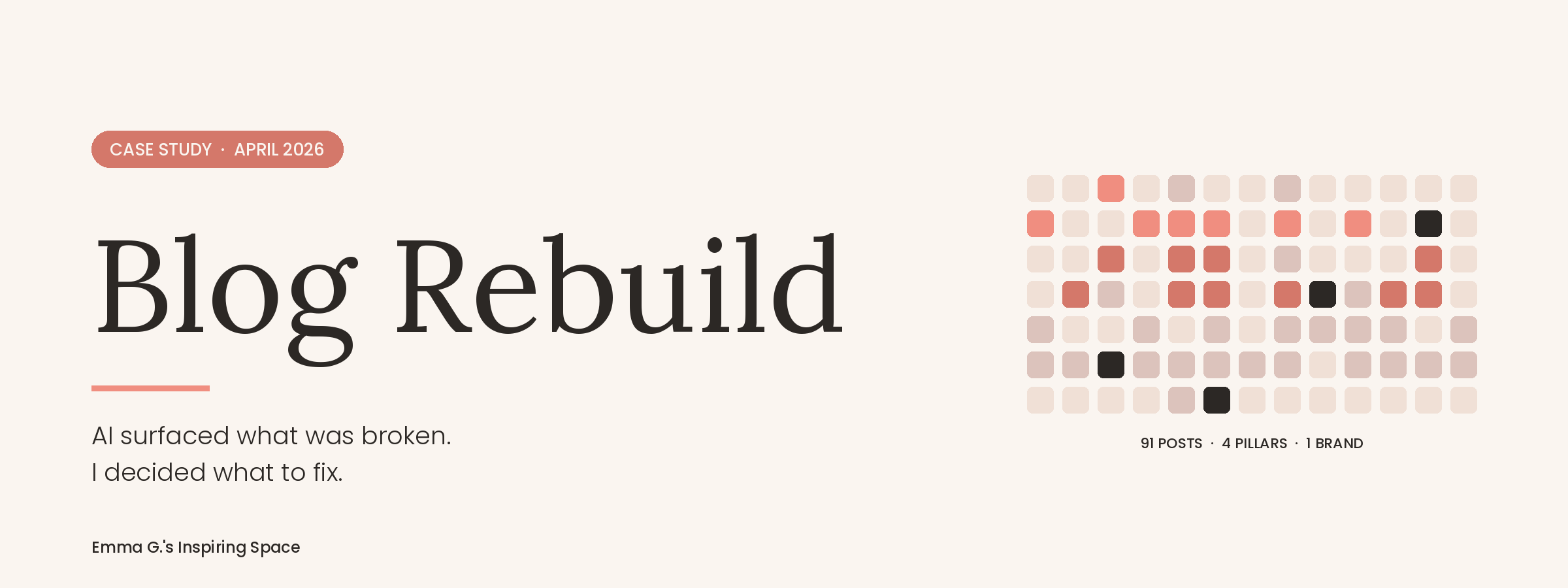
emmagsinspiringspace.com — a personal blog rebuild. 91 published posts, 12 flat tags, 6 years of content drift, three competing brand signals on the homepage.
The problem:
Four years of accumulated structural debt. Posts uncategorised, taxonomy flat, navigation outdated, and three different versions of the site owner's name appearing on the homepage. Nothing was broken — and nothing was working hard either.
Project duration:
~2 weeks, April 2026, from XML export to live relaunch.
My role:
Lead designer, information architect, and decision-maker. Claude (AI) operated as the data-layer analyst.
The goal:
A discoverable, brand-coherent personal site with clean separation between blog content and design portfolio.
Responsibilities:
Audit interpretation, taxonomy redesign, navigation restructure, brand unification, CSS implementation, and email template build.
Understanding the user
User research:
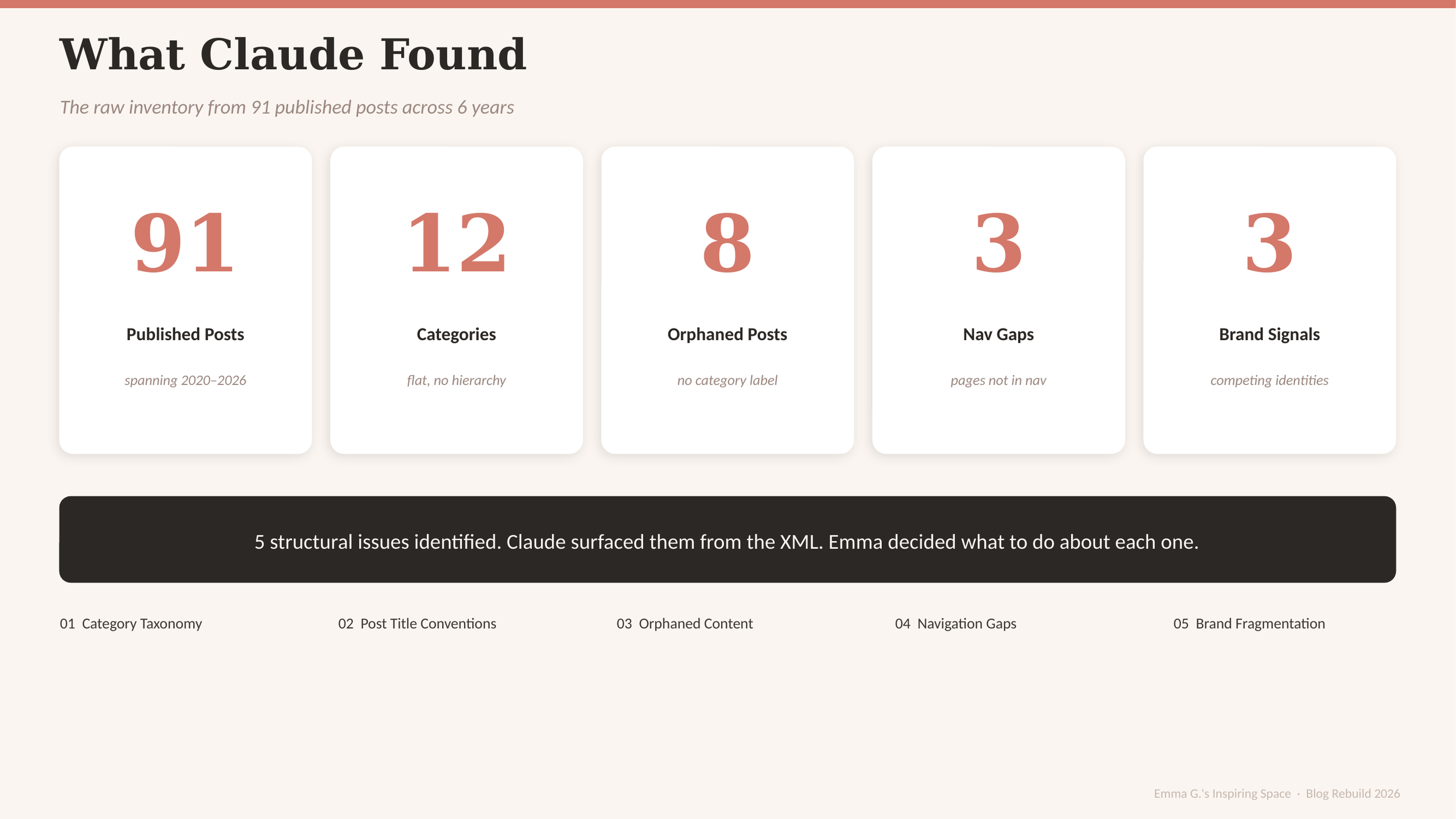
I exported the full Squarespace site as XML and ran it through Claude. Within an hour, the AI returned a structural audit of the archive — five findings: flat taxonomy, inconsistent post-title conventions, 8 orphaned posts, 3 navigation gaps, and 3 competing brand signals on the homepage. Every finding was verifiable against the export.
Reader model:
The blog serves a mixed English/Mandarin-speaking audience with overlapping interests in family creative projects, food, home, and design career content. The site also doubles as a portfolio touchpoint for design recruiters, which means inconsistencies that reach the live site damage credibility on two axes simultaneously.
Information Architecture:
Claude returned a complete first-draft information architecture:
5 parent categories including a new "Mindset & Growth" pillar
5 navigation items — Home, Design Portfolio, Blog, Emma's Kitchen, About
A binary brand choice — pick "Emma Greer" or pick "Greer TaiTai"
The diagnosis was correct. The proposed fixes were defensible. Most of the project's value was already on the table at this point.
I accepted the AI's recommendations on two of the five findings — post-title conventions and orphaned-content cleanup. Both are pure execution problems with no taste component: rename consistently, assign every post a category, ship.
The other three required a different kind of decision.
Starting the design
Refining the design
Decision 1 - Categories
I split the work along a clear axis: data-layer work to the AI, judgment-layer work to me. AI cannot see where the blog is going next — that information lives only with the designer. The three overrides below are the result.
Before (AI recommendation)
5 pillars, including "Mindset & Growth" as a new category
After (my decision)
4 pillars — dropped Mindset & Growth entirely
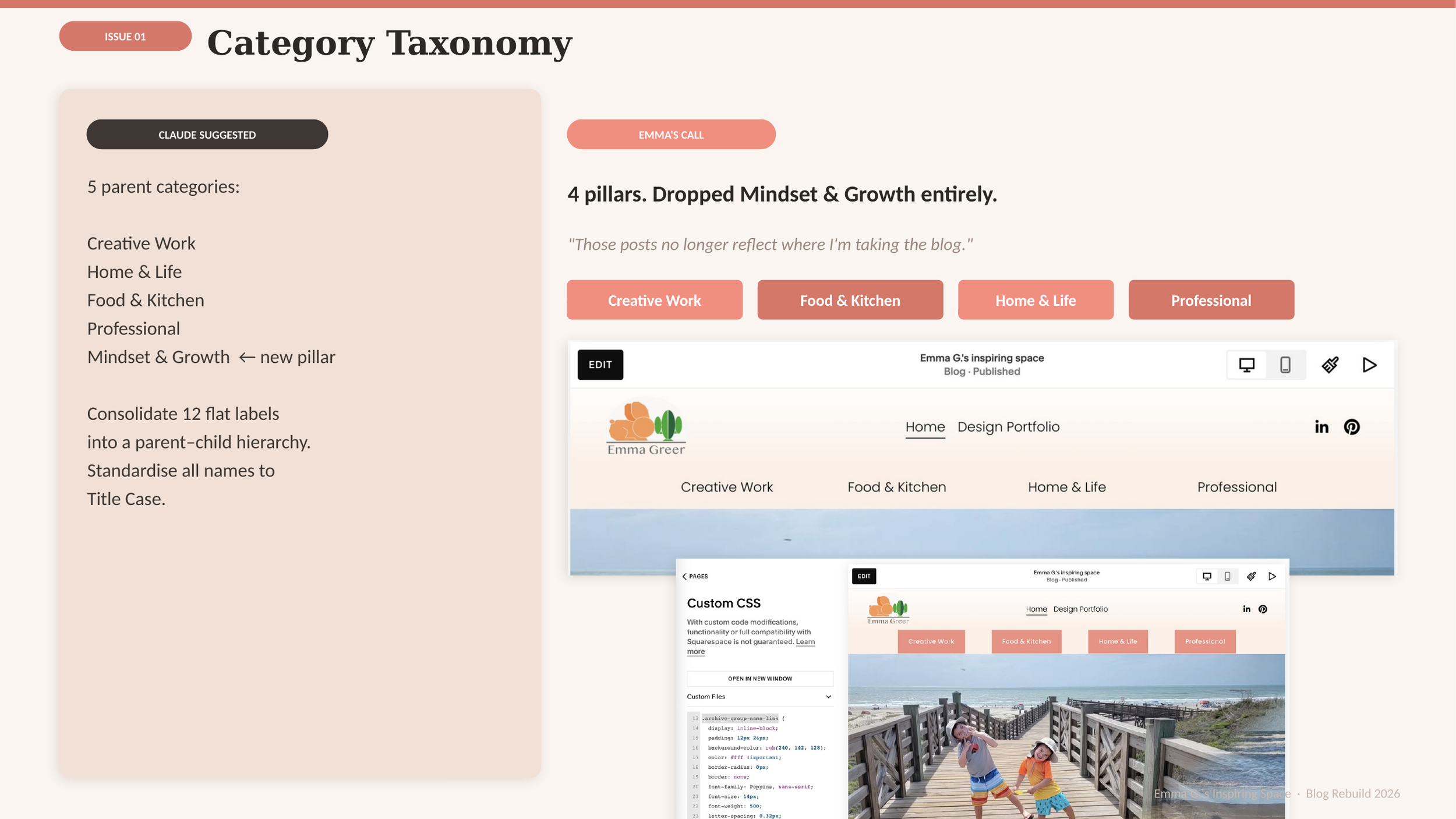
The AI's proposal accurately reflected what was in the archive. It did not reflect where the blog is going. Mindset content reflects a phase I've moved on from; preserving it as a pillar would memorialize old direction at the cost of forward focus.
Decision 2 — Navigation
I split the work along a clear axis: data-layer work to the AI, judgment-layer work to me. AI cannot see where the blog is going next — that information lives only with the designer. The three overrides below are the result.
Before (AI recommendation)
Expand to 5 nav items
After (my decision)
Collapse to 2 — Inspiring Space, Design Portfolio
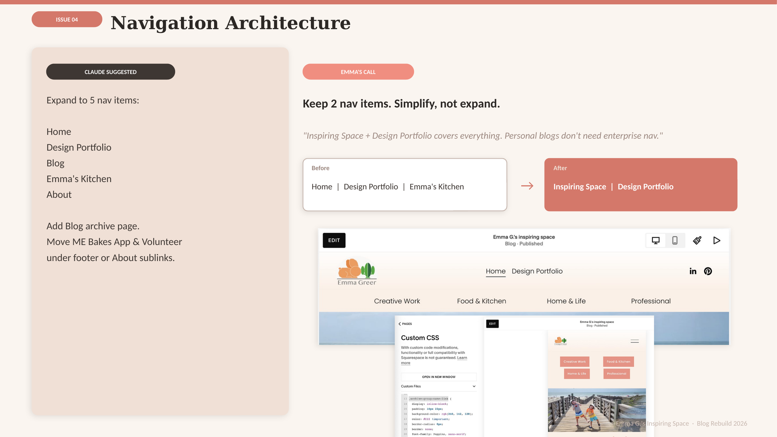
The AI applied enterprise UX best practice. A personal blog is not an enterprise site. Adding nav items doesn't help discoverability when the site is small enough that scrolling beats menu navigation — and a shorter nav reads as more confident than a longer one.
Decision 3 — Brand identity
Before (AI recommendation)
Binary: pick "Emma Greer" or pick "Greer TaiTai"
After (my decision)
Neither. Unified under "Emma G.'s Inspiring Space"
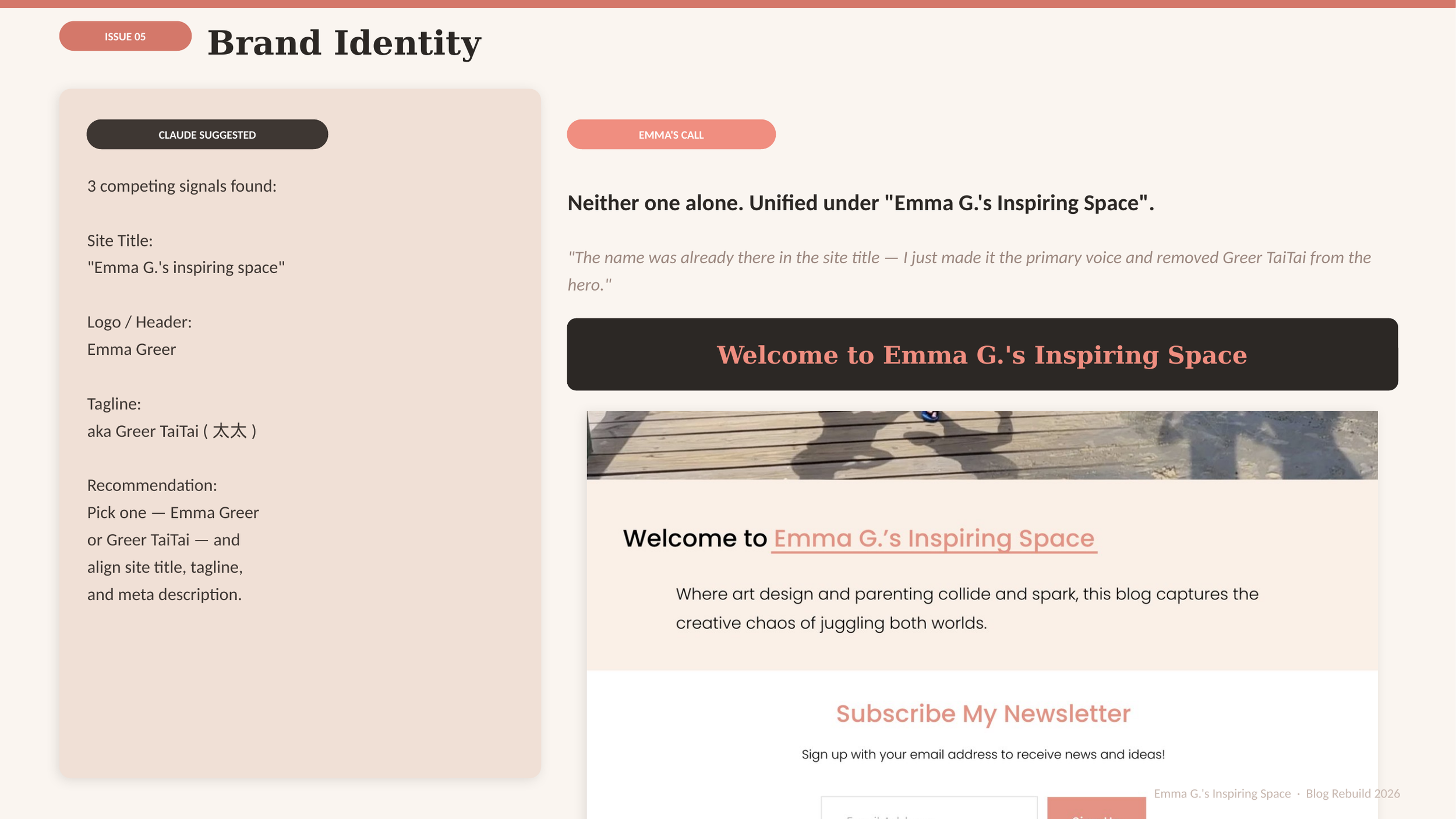
The most useful move in the project was refusing the frame I was given. Both AI options were defensible. The right answer was a third option — already sitting in the site title field, and not represented anywhere in the binary.
Going forward
Takeaways
Impact:
The site relaunched at the end of April with a four-pillar taxonomy, two-item navigation, unified brand, every post categorised, and a custom Mailchimp template matching the site palette. Two of five AI recommendations followed exactly. Three overridden — and the three overrides are the parts I'm most confident about.
What I learned:
AI is a frame-generator, not a frame-decider. Every recommendation it makes is anchored to the data it can see. None of it can see direction — and direction is where design judgment lives. The diagnosis is the easy half. The judgment is the work.
Next steps
Discipline categorisation at publish
Tag every new post into one of the four pillars at publish time to prevent orphan accumulation.
Measure post-relaunch traffic
Compare 30-day pageviews against the pre-relaunch baseline to validate the IA changes.
Test newsletter conversion
Track Mailchimp signup rate before and after the unified subscribe block.
Let’s connect!
Want to talk about this project, or about working with AI on small high-judgment design problems?
Contact Information
LinkedIn: www.linkedin.com/in/emmagreer